Chart Comparison
So as Pete mentioned while he was guest posting here, he, Bill, and I will be starting up a new blog very soon. Stay tuned for an official announcement.In the meantime, I found these two charts that I found very disturbing.
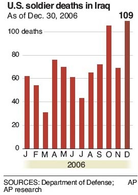
First, here is a bar graph showing off the - ahem, progress Bush has made in the War on Terrorism:
And here is a graph which charts traffic to THIS SITE, Marmaduke Can Vote.
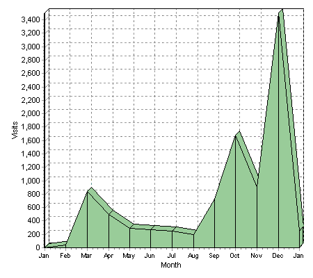
Kinda similar... I'm hoping that means that when my hits start declining in 2007, it will bring down casualties in the war.
posted by Jon @ 2:16 AM
![]()

0 Comments:
Post a Comment
<< Home